01Selected work
OFFFORM
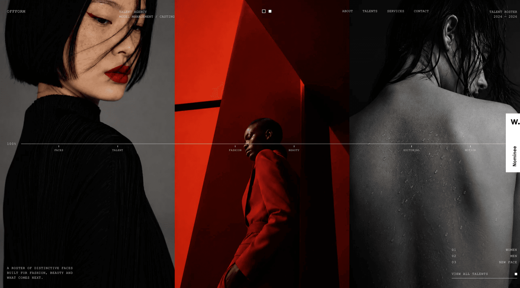
A model agency sells faces, and almost every agency site buries them behind a grid of thumbnails and a paragraph about the agency. OFFFORM opens on three of them at the full height of the screen, edge to edge, with the navigation and the roster set in small tracked capitals around them — the interface gets out of the way of the only thing anyone came for.
Year
2026
Status
In build
Role
Design, Development, Art direction
01The brief
The roster is the argument
An agency is judged on who it represents, so the site had to be a way of looking at people rather than a brochure about a business. Everything that would normally open a site — the positioning line, the services, the history — sits below or around the photography instead of in front of it.
02The screen
Three panels, one rule
The hero is three photographs held at full height, and a single hairline runs across all of them at the same point, carrying the categories the roster is cut by.
The panels
Full-bleed and full-height, so a face is met at something near life size rather than as a thumbnail in a grid.
The rule
One line across the width, marked with the categories — faces, talent, fashion, beauty, editorial, motion — which doubles as the progress of the roster being scrubbed through.
The roster
Women, men and new faces, numbered and set at the right, with one link through to all of them.
The statement
A roster of distinctive faces built for fashion, beauty and what comes next — in the bottom corner, in the same small capitals as everything else, said once.
03The look
Monospaced capitals, and nothing else
Every word on the screen is set in the same small tracked monospaced capitals at the same size, in white, with no headlines and no buttons that look like buttons. It is the typographic language of a contact sheet rather than a website, and it means the photographs carry the whole of the contrast: the interface has no colour, no weight and no scale of its own to compete with them.
Next project
Jackz Music