03Selected work
SEROTONINN
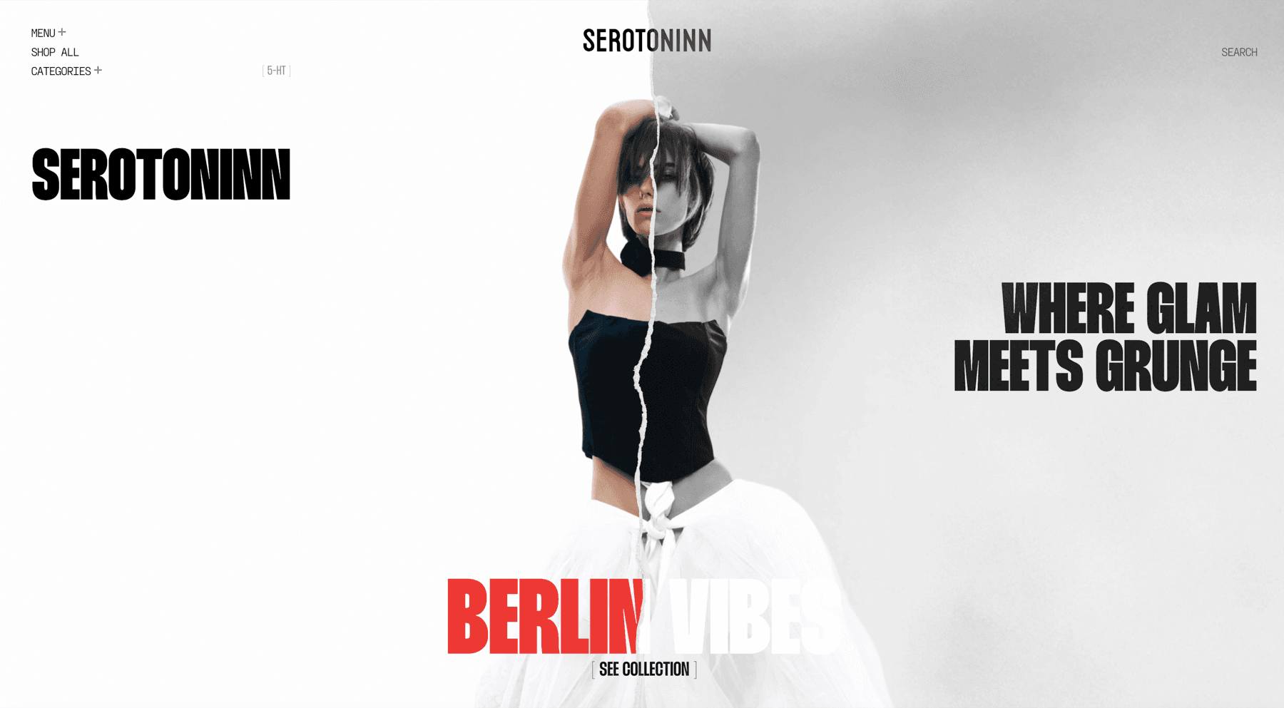
The label sells one idea — where glam meets grunge — and a store that simply said so in a line of copy would have been selling it the way every other label does. The page is built as the idea instead: a torn edge runs from top to bottom of the screen, the photograph is printed across it, and each half of the picture is treated as though it belonged to a different brand.
Year
2026
Status
In build
Role
Design, Development, Art direction
01The idea
A tear, not a headline
The split is the whole design. The same frame is graded two ways and torn between them, so the eye reads the contrast before it reads a word — and the copy on either side is then free to be four words long.
The rip
A real torn-paper edge running the full height of the screen, not a straight divider. The join is where the two treatments of the photograph meet.
The name, twice
Set small and centred over the tear so the rip runs through the letters, and again at display size in the left margin.
Berlin vibes
The collection line across the foot, half red and half white, cut by the same tear, with the only button on the screen under it.
5-HT
Serotonin’s own chemical shorthand, bracketed in the corner where a site usually puts a version number. The label is named after the molecule, so the molecule signs the page.
02The shop
A store that opens as a poster
Shop all, the categories and the search sit in the margins in small tracked capitals, so the first screen is a poster and the storefront is one click behind it. It is a trade most shops will not make — a catalogue is easier to measure — but a label whose whole proposition is a look has to show the look before it shows the grid.
03The look
Heavy condensed on paper white
Black condensed capitals set tight and large against a near-white ground, one red for the collection and nothing else, and a photograph that carries every other value on the page. The type has no curves, no outlines and no effects on it: against a torn edge and a graded portrait, anything more would be a third voice.
Next project
Karmy