06Selected work
Siena Film Foundation
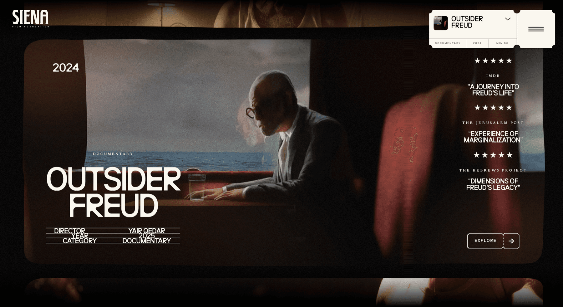
A foundation’s films are usually listed as a grid of posters with a paragraph each, which flattens a documentary and a feature into the same tile. This is built as the thing a cinema actually hands you: each film is a ticket, cut along its perforations, and the page is the strip they come off.
Year
2026
Status
In build
Role
Design, Development, Art direction
01The idea
One film, one ticket
The ticket is the whole system, and it appears at three sizes: the selector in the corner that names the film you are on, the frame the film itself sits in, and the button that takes you into it. Every one is cut with the same perforated edge, so the interface is a strip you tear along rather than a set of panels.
The stub
Top right: the film’s name, and under it the three things a listing has to carry — category, year, running time — ruled into cells like a real ticket.
The frame
The still is held in a wide rounded rectangle with the corners taken off, the shape of a screen rather than a card, and the next film is already visible below it.
The slate
Director, year and category set as a ruled table with the rules running through the words, the way a slate or a call sheet is filled in.
The press
The reviews sit down the right at the height of the film, each with its stars and its source, so the case for a film is made beside it rather than on a page nobody opens.
02The look
Warm grain, and no black
The ground is a warm near-black that the stills are graded into, so a frame from a film and the page around it share the same light instead of a photograph sitting on a black rectangle. The type is bone white, wide and condensed for the titles and tracked small capitals for everything else, and the whole screen carries a light grain — the one texture that reads as film without pretending to be a projector.
Next project
OFFFORM